Company Background
Ben & Jerry's is an ice cream company, established in 1978. Ben & Jerry’s has operated on the business model of linked prosperity, a three-part mission which looks to benefit everyone who is connected with the business. The uniqueness of Ben & Jerry’s, even when they sold out to Unilever in 2000s was to maintain their product, economical and social mission in unison. These missions are driven by their core value of linked prosperity, which is the idea that as the company prospers, all those touched by the company must also prosper.
We took a step back and began to seek opportunists from Unilever’s perspective, which is Ben and Jerry’s parent company. We found that Ben & Jerry's was facing a growing threat from Amazon.com due to their weaker online presence. In order to secure more revenue, Unilever initiated the Business-to-consumer business model which has its own brands start direct online sales to their customers.
Why web?
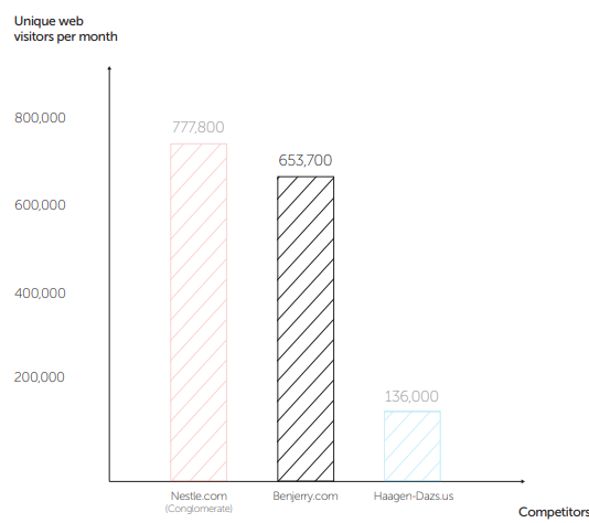
Ben & Jerry’s website already receives high amounts of traffic directed from social media and searches totalling aproximately, 653,000 unique visits each month. (SimilarWeb,October, 2016)
The brand needed a business-to-consumer online sales system in order to move the brand away from online retail competitors, while building stronger relationships with their customers. Our team decided to rethink their current website and integrate an online sales platform. We knew the website had to be impactful and emotional while keeping the brand’s joyful and whimsical style.
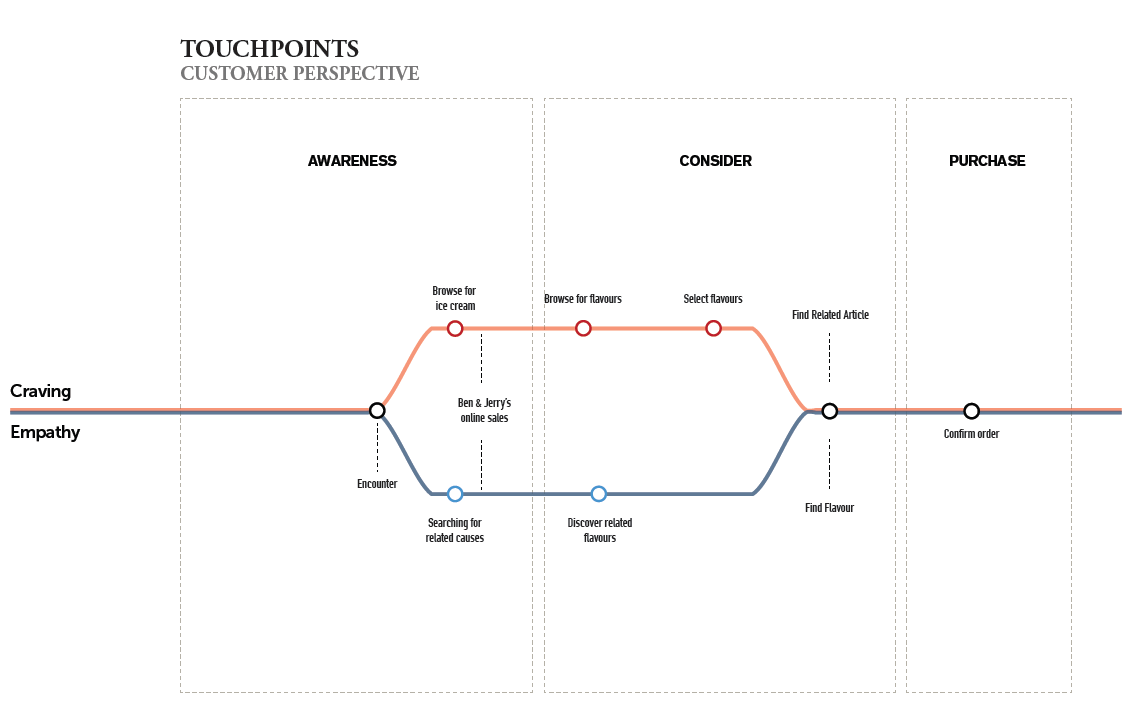
Journey Framework & Persona
In the journey framework, we discovered two types of customer bases.
Craving: Interested primarily in the ice cream and may glance at the social causes.
Empathy: Interested in social causes and show support through their purchase.
When evaluating the “consideration” phase, the current web layout of Ben & Jerry’s website does not allow for seamless crossover between the two customer groups.
We examined the Journey Framework from two perspectives
Empathatic Customer - This group would be buying ice cream flavours that speak to the movement.
Craving Customer - This person is primarily here for the ice cream flavours.
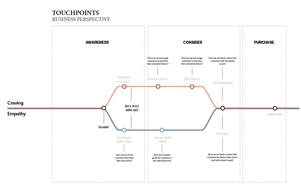
Journey Framework - Business Perspective
Empathatic Customer - Ben & Jerry's would want to provide them with the latest updates about their causes. As well as, offer them flavours related to the cause that may interest them.
Craving Customer - Along side providing them with tools to quickly find the flavour to suit their taste buds, Ben & Jerry's would want to intrigue them with social causes.
Sketching + Wireframing
I began by looking at the current website, and through brief user testing and research. Upon examination of the website statistics consumers spend on average three minutes on the website with only two pages visited. (Data collected from SimilarWeb).
I sketched out some wireframes to see map out the key touchpoints of both the empathatic and customer bases.
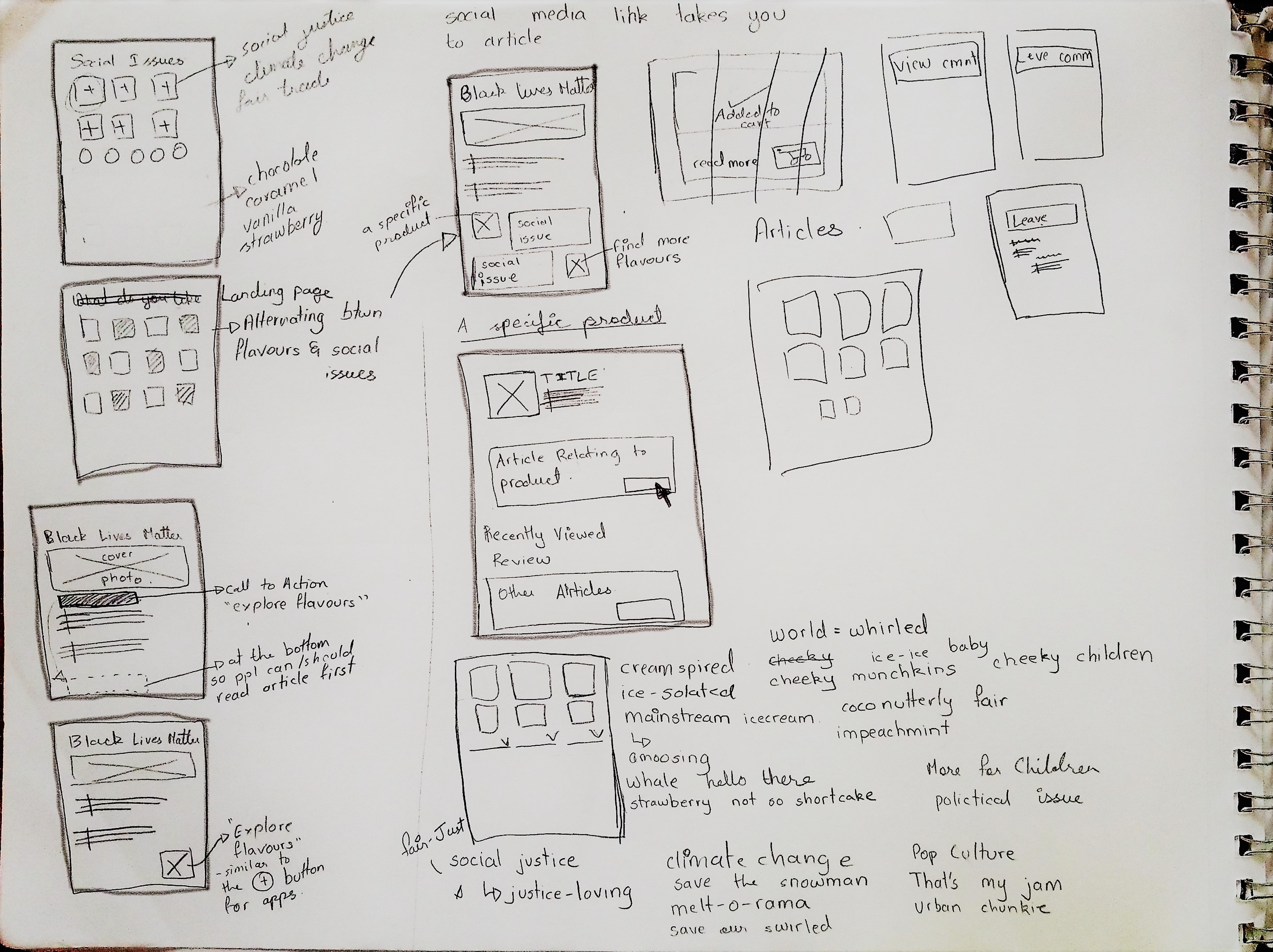
Empathetic customer: Discovering Ben & Jerry’s ice cream on twitter, the user would be drawn to the website/brand through the social cause. This would serve as a ROI hotspot if the user decides to purchase the ice cream.
Craving customer: This user would be coming on the website through the homepage. Their motivation lies in the want of ice cream. This is a traditional product page, and we added a filter on the side bar that focuses on both flavours and causes.
Re-evaluating the above process. We revisted the drawing board and found out that there was a lack of connection between the cause and the ice cream after purchasing the product. This led us to redefining the layout and added more touchpoints after the purchase.
The Prototype
On the landing page, we wanted to highlight the multiple key points that show the values and selling point of Ben & Jerry’s.
We achieved this by using graphic design principles to organize the information displayed by creating a single column layout with divided mini cells.
By changing the copy of the buttons, we are able to relate with the user by providing meaningful clicks for the user to progress within the website and maintain continuity.
At the post - purchase step, we relate back to the consumer by giving them brief memorable information of how their purchase is impacting the society at large.
Reflection
I enjoyed the challenge of working with Ben & Jerry’s. When enjoying ice cream, people want to see and taste the ice cream flavours; not everyone will want to download an app or visit the kiosk at the ice cream parlour. Once the two customer groups were identified (empathy + craving), creating the user flow was an easy process and I was able to make better design decisions. In the end, we were able to re-vamp the website as well maintain overall branding. Re-designing the website is not something every business wants to do, but because of high traffic on their website and a push from the parent company, Unilever, for a business-to-consumer model, this is a step in implementing an ecommerce system.