Target audience
The target audiences for this web app are branch level staff, branch managers and the operations manager.The web app was developed in a manner to provide easy access to all levels.
Storyboarding
Even though the web app appeared simple however, I couldn't help but ponder over some simple questions while running through the storyboarding process. For example:
- Will the user know how to do this?
- Do I need to create a separate page for higher level staff?
- How can we ease the login process so they don’t have to create a new login?
- ...etc
The key features of this web app are:
- Training videos by category
- Completion tracker
- Dynamic report generation
Wireframes
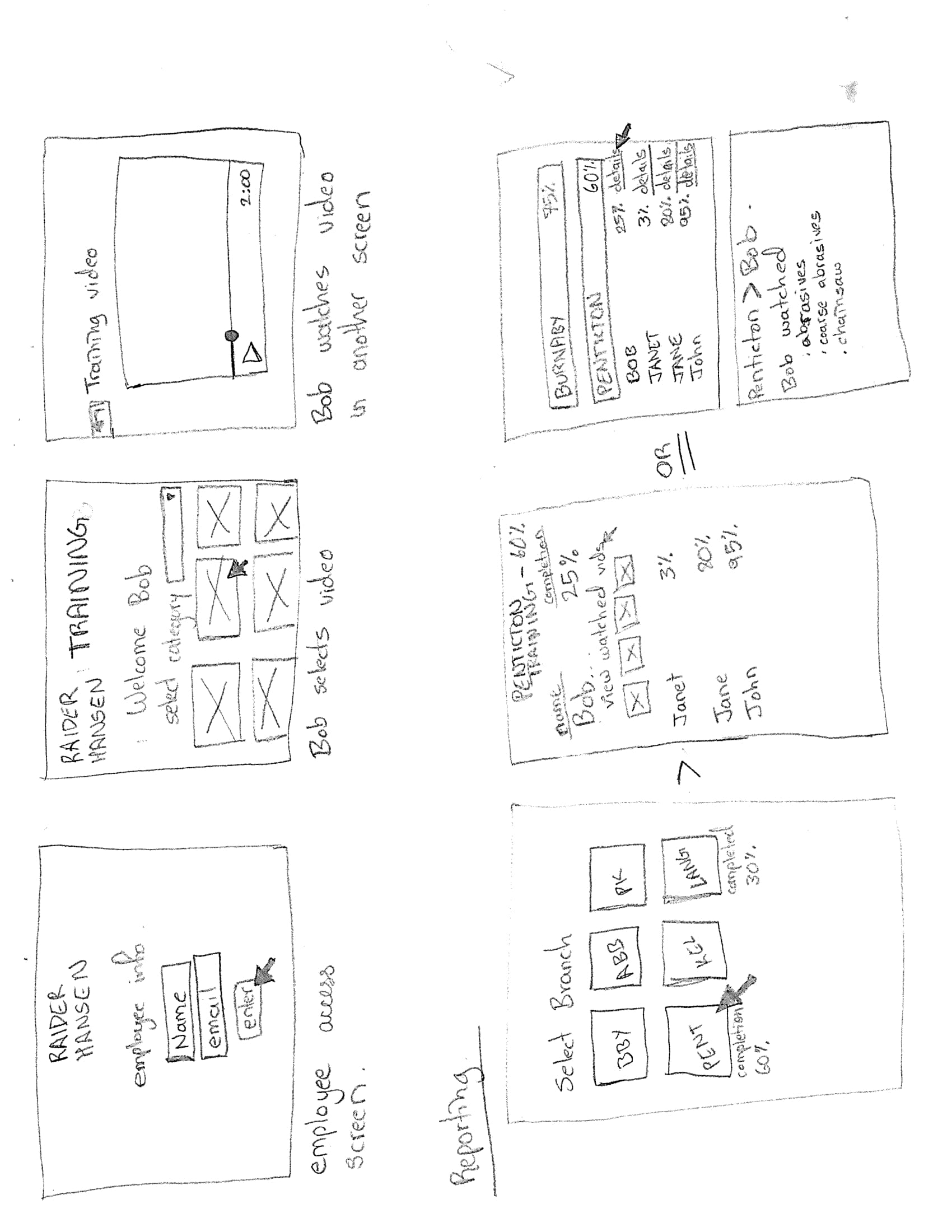
In the wireframes, I started off with the employee view. I sketched out the vision of an employee logging in, and viewing the videos. I collaborated with the backend developer to see if they were able to implement the features such as: tagging new videos, clicking on buttons, auto-tracking of item watched.
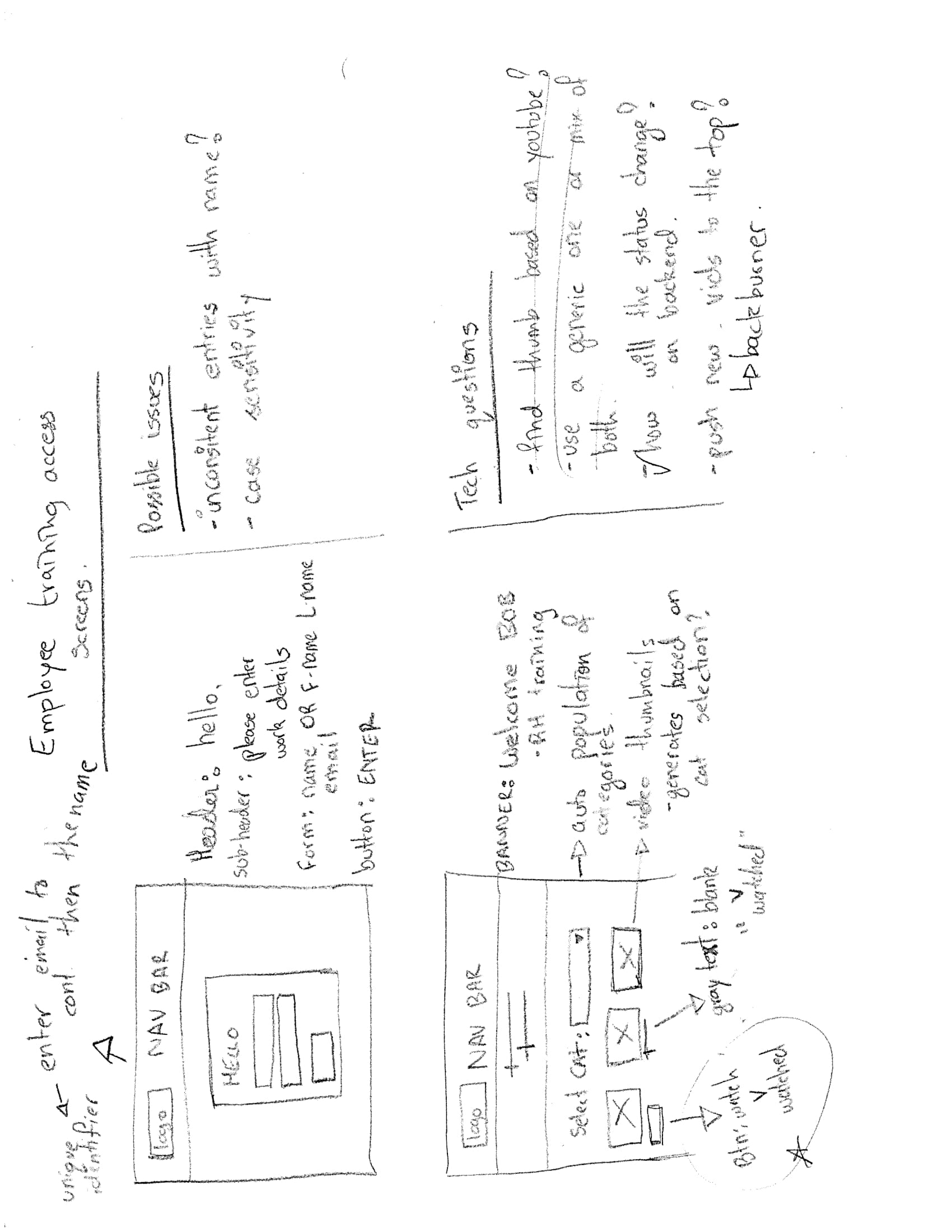
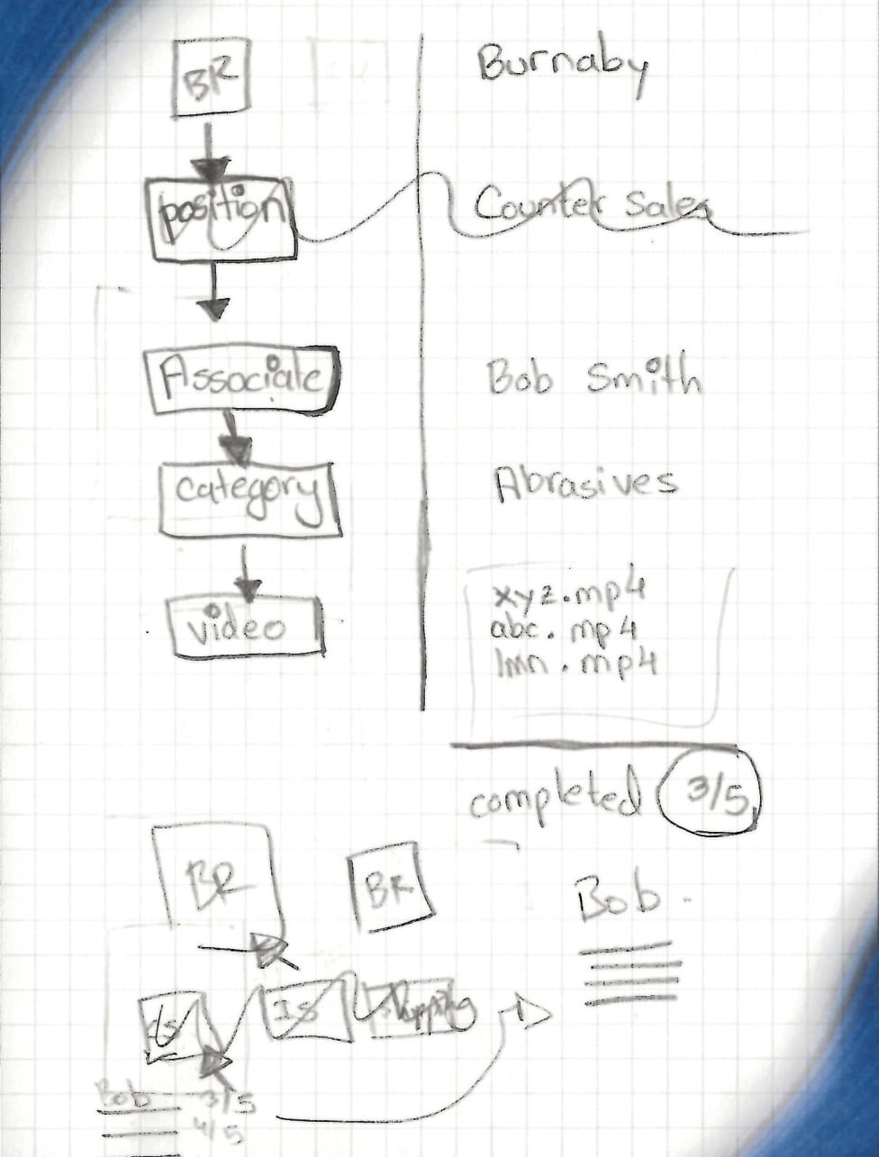
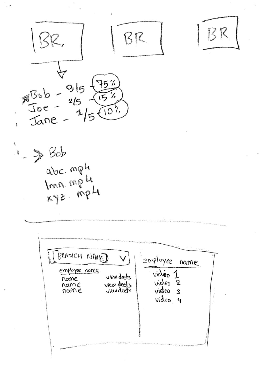
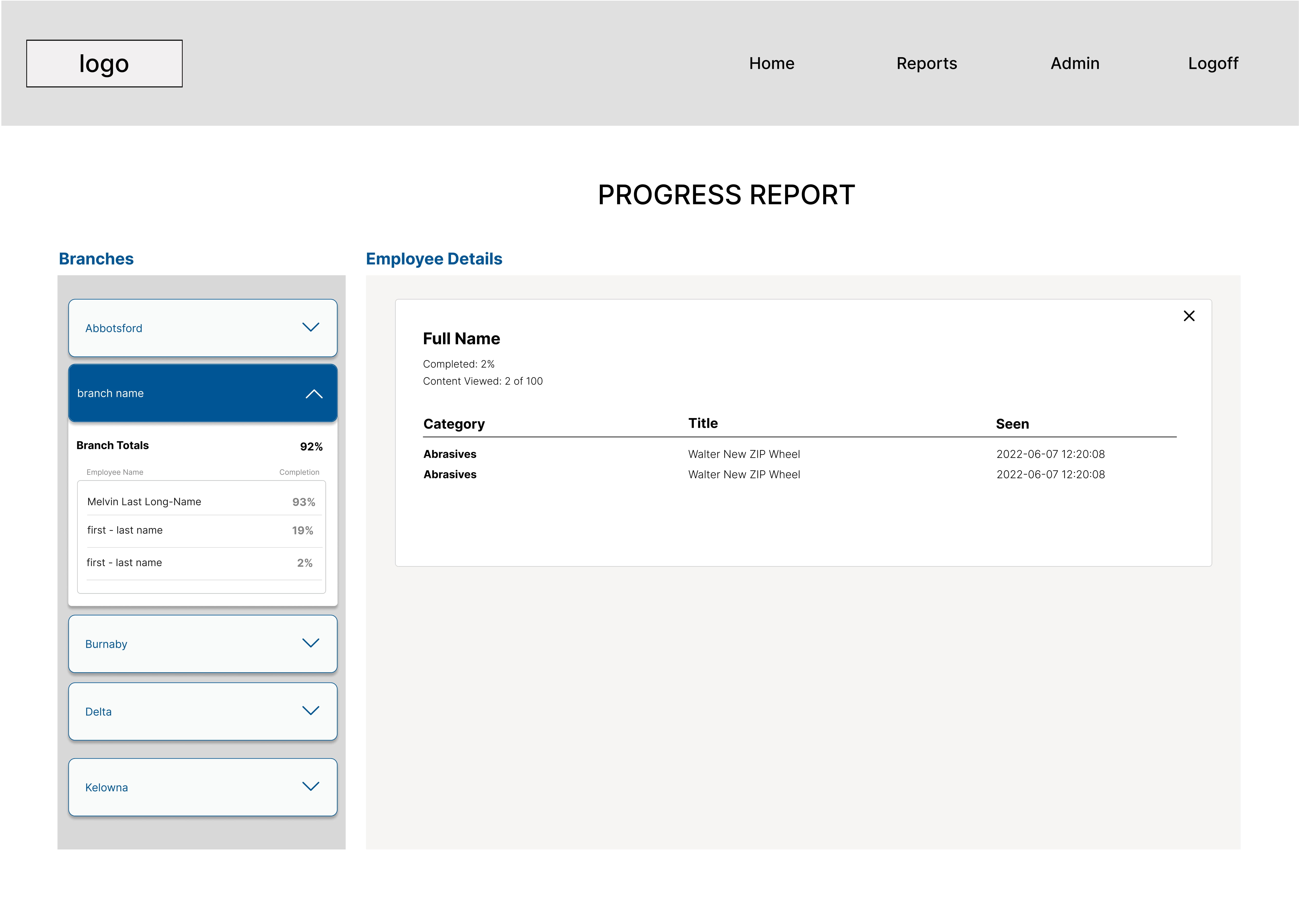
In the reporting section of the wireframes, it was discovered that it would be a challenge selecting a stakeholder to design for. Branch managers are interested in their employee level details whereas the operations manager is only interested in the branch details. In the sketched wireframes, I worked alongside the developers who were able to guide me on which performance metric to emphasize on. In the reporting wireframe, I worked on the information architecture to understand which layout method worked better; whether it was to display the information by branch and all visible at the same time or to have the user select a branch with a drop-down menu. Utilization of the annotated sketches helped me communicate my ideas to the developer. It helped me work within the limited real estate with the 80 employees across 9 branches.
Initial prototype
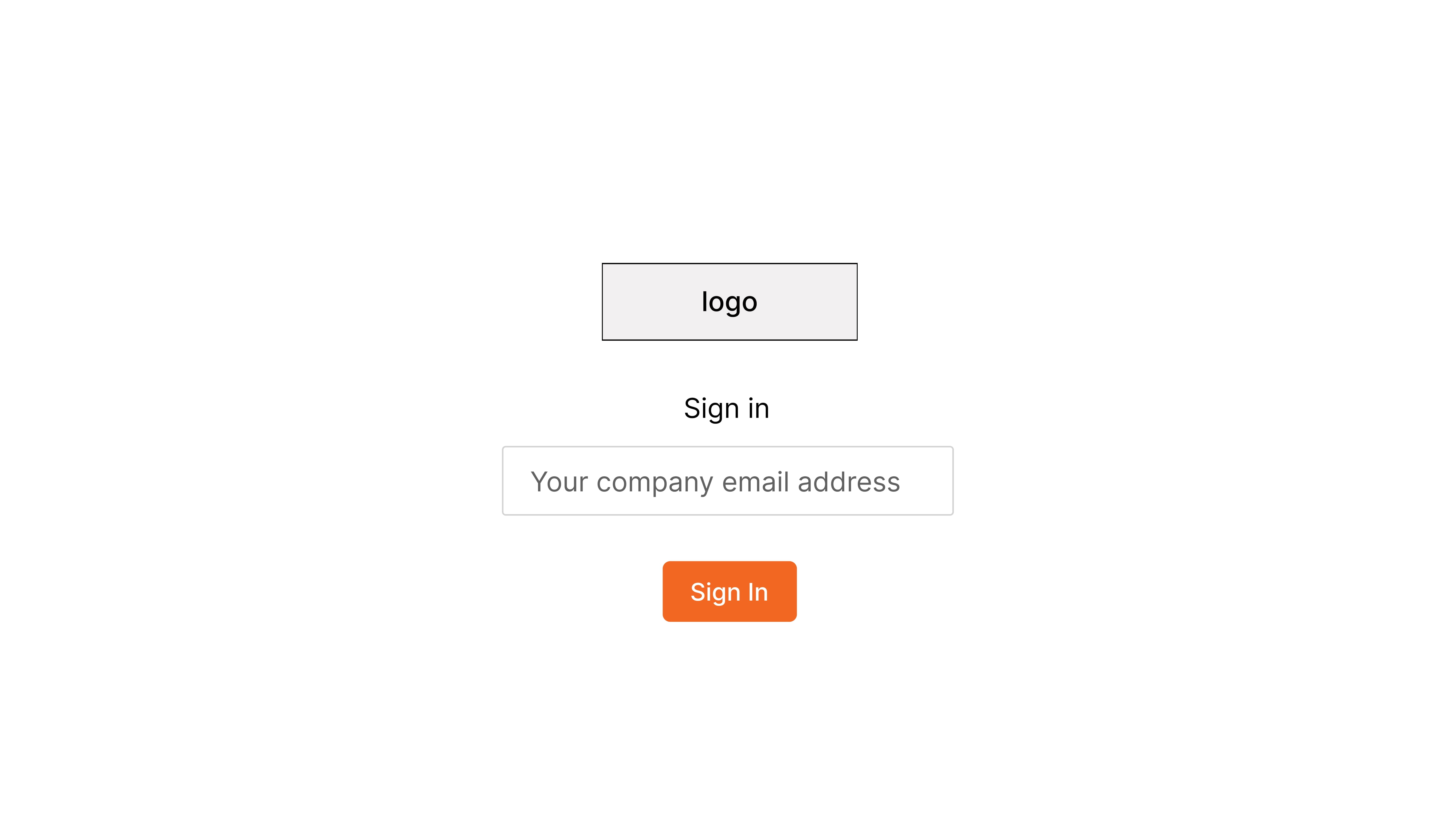
Login screen
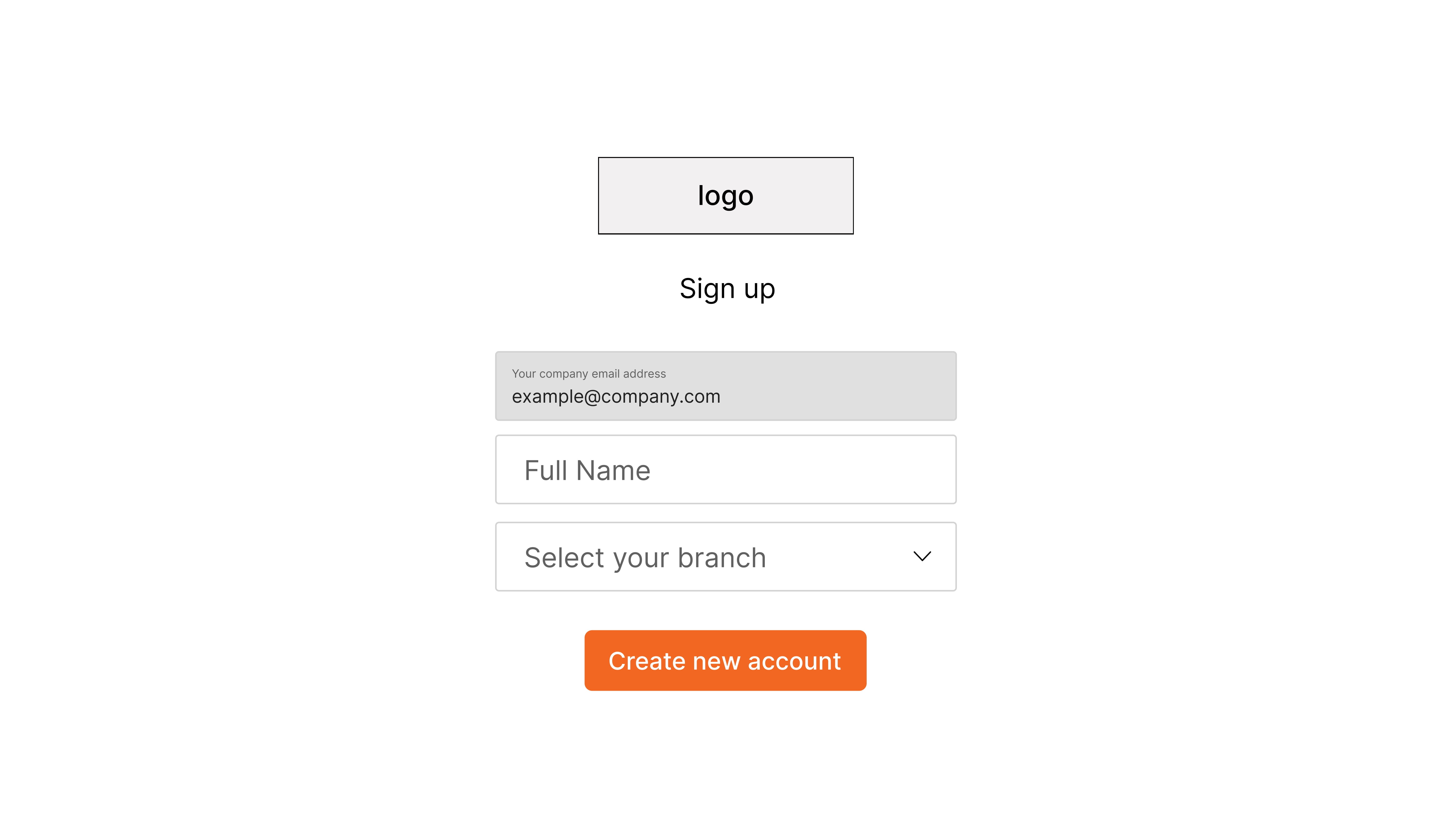
The login information is pre-saved in the system, so all they need is their email. However we don’t want everyone to be creating new accounts with different emails, should they forget to use their company email.
The frustration can get high if the user cannot log in. To avert this situation, there is a modal that will prompt them to contact IT or create a new account should they enter the wrong email address.
All of the new videos are pushed to the top and the user can view videos from certain categories, such as a need for a refresher on power tools or fasteners.
The materials are also marked as website, pdf, and image which opens in a new tab

I enjoyed creating this UI. There is quite a bit of information architecture that was prototyped. I gave the most real estate to the employee details, and organized it by branch. This way the branch manager can be concerned with their branch only.
There are few future updates that I am considering for the operations manager to view branch level metrics at a glance.
Interactive Prototype
Future considerations
Currently this is an MVP as it was created on a short timeline. The senior management wanted to get something up and running. We did a soft launch of this internally, and it seems well received by the staff. The feedback has been positive till date with the most common being, ease of use. The next design sprint will be focused on adding more information to the thumbnails in the content screen, and further refining the reports tab.
The key goal of this app was to have something simplified and dynamic with a low learning curve. While I work on refining existing features, the staff can continue to use the system and measure KPIs.
Please note: Some wireframes are a modification to the real app, due to privacy reasons